Cuerno

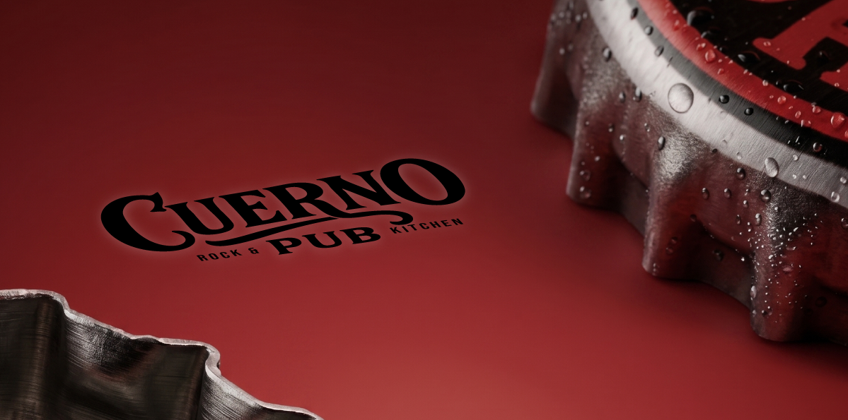
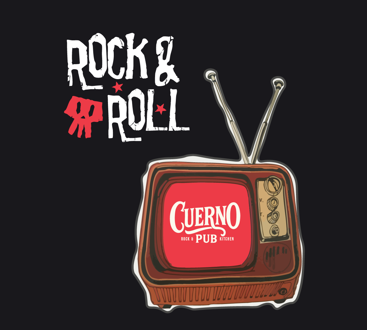
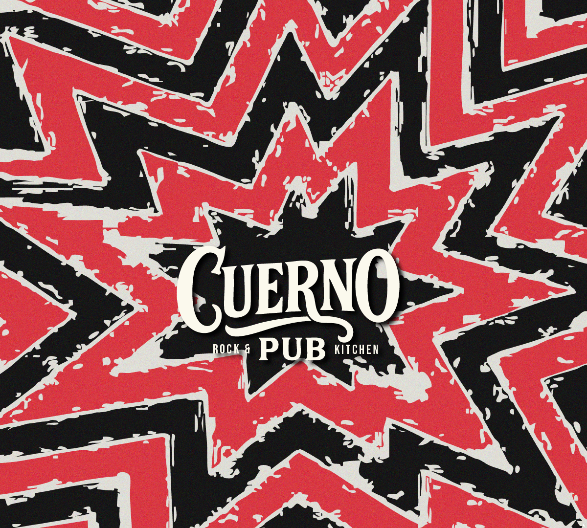
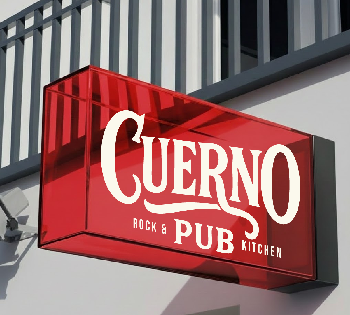
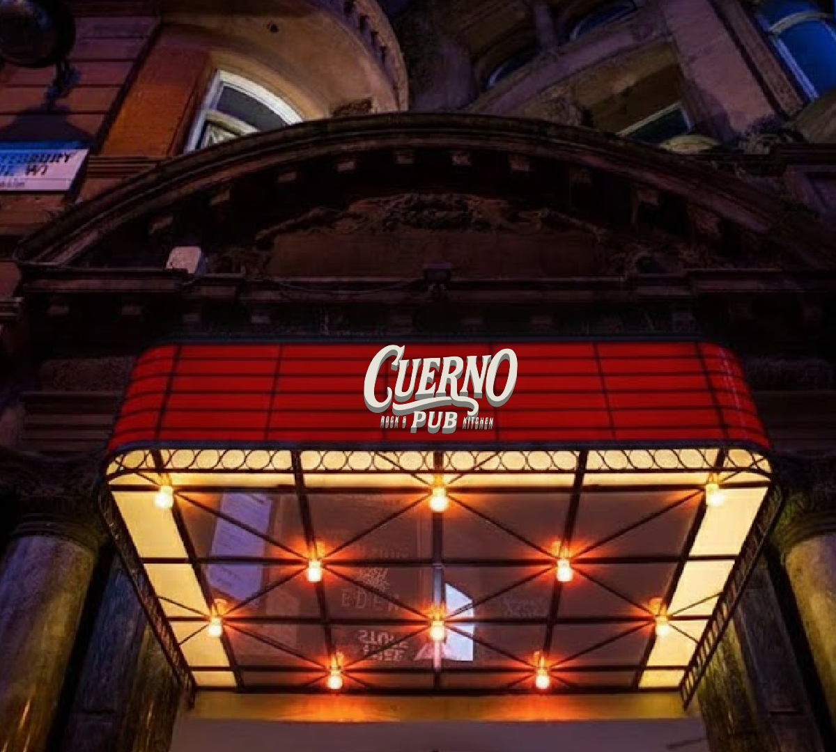
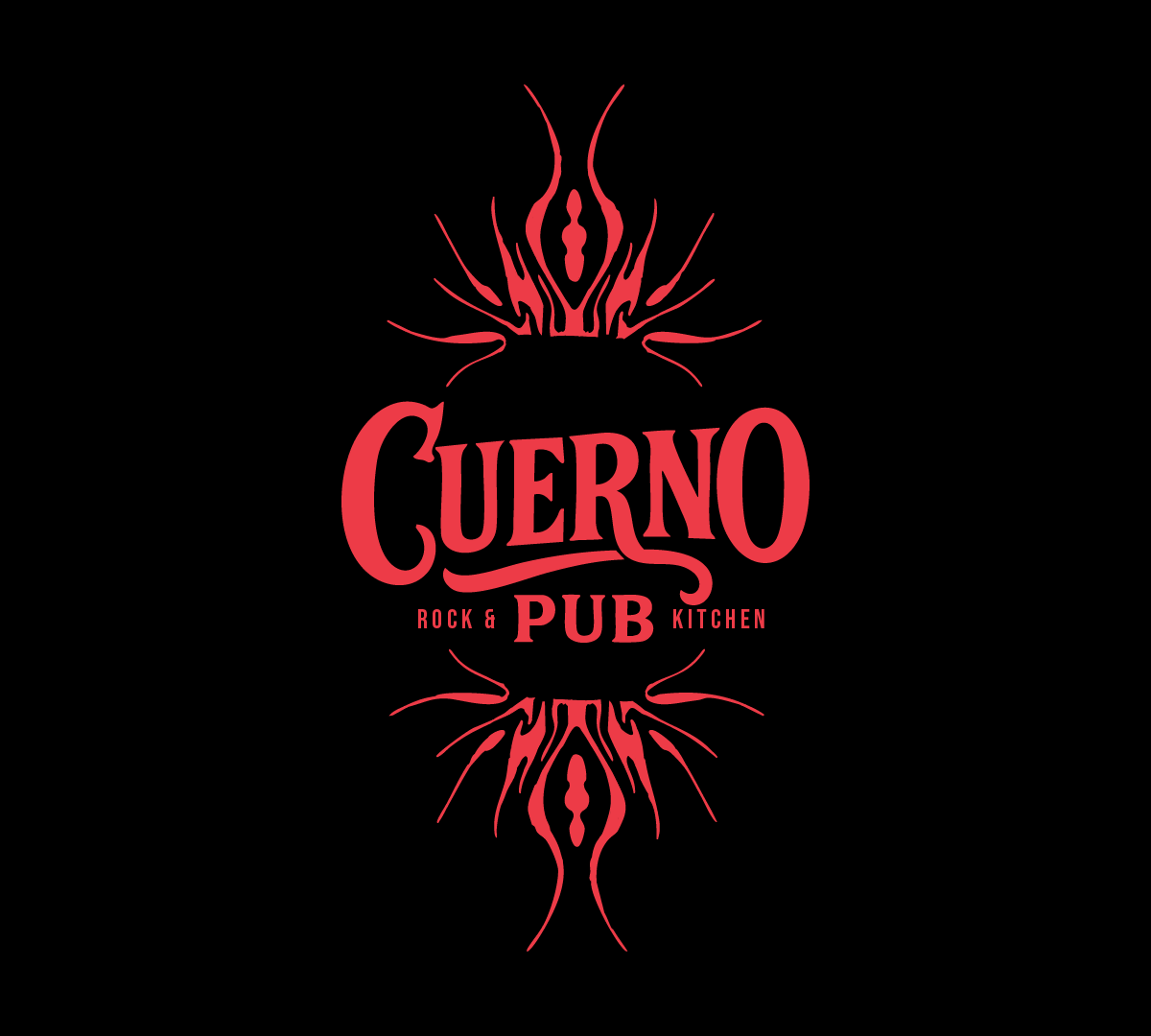
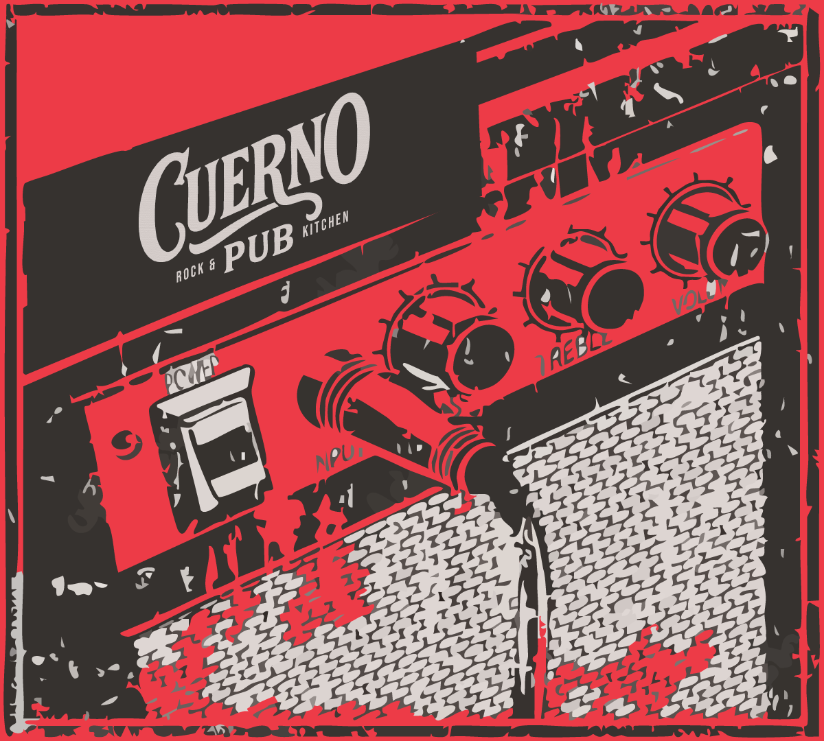
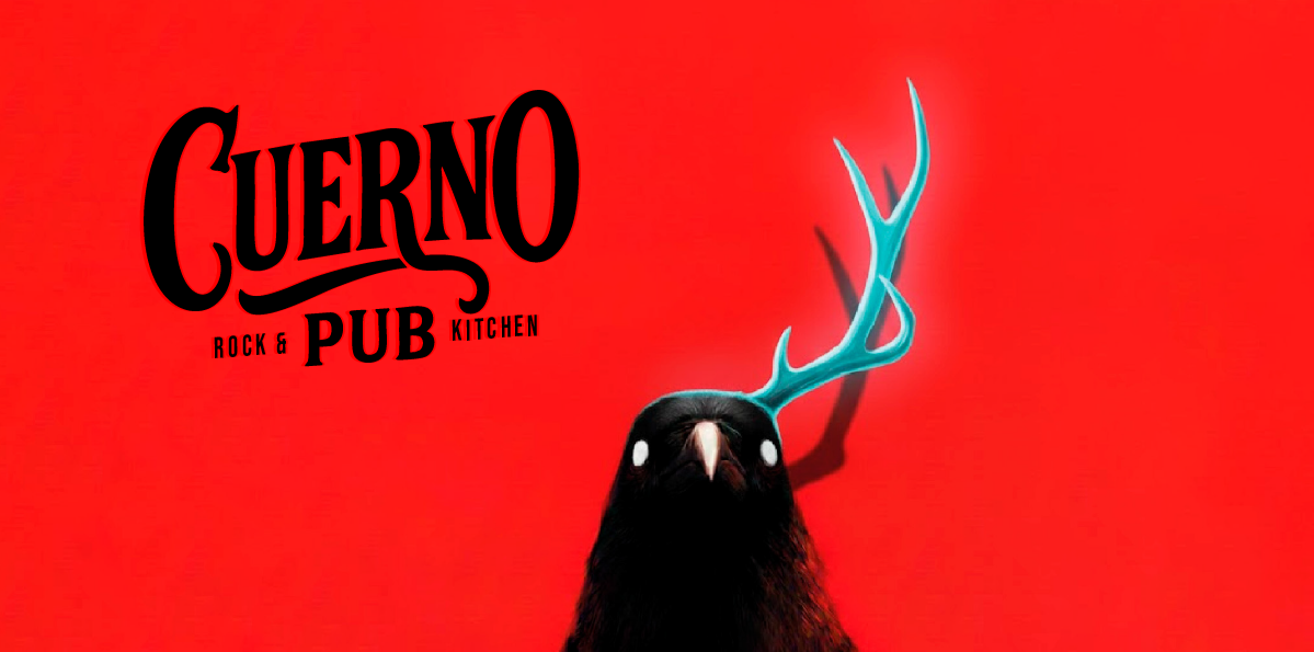
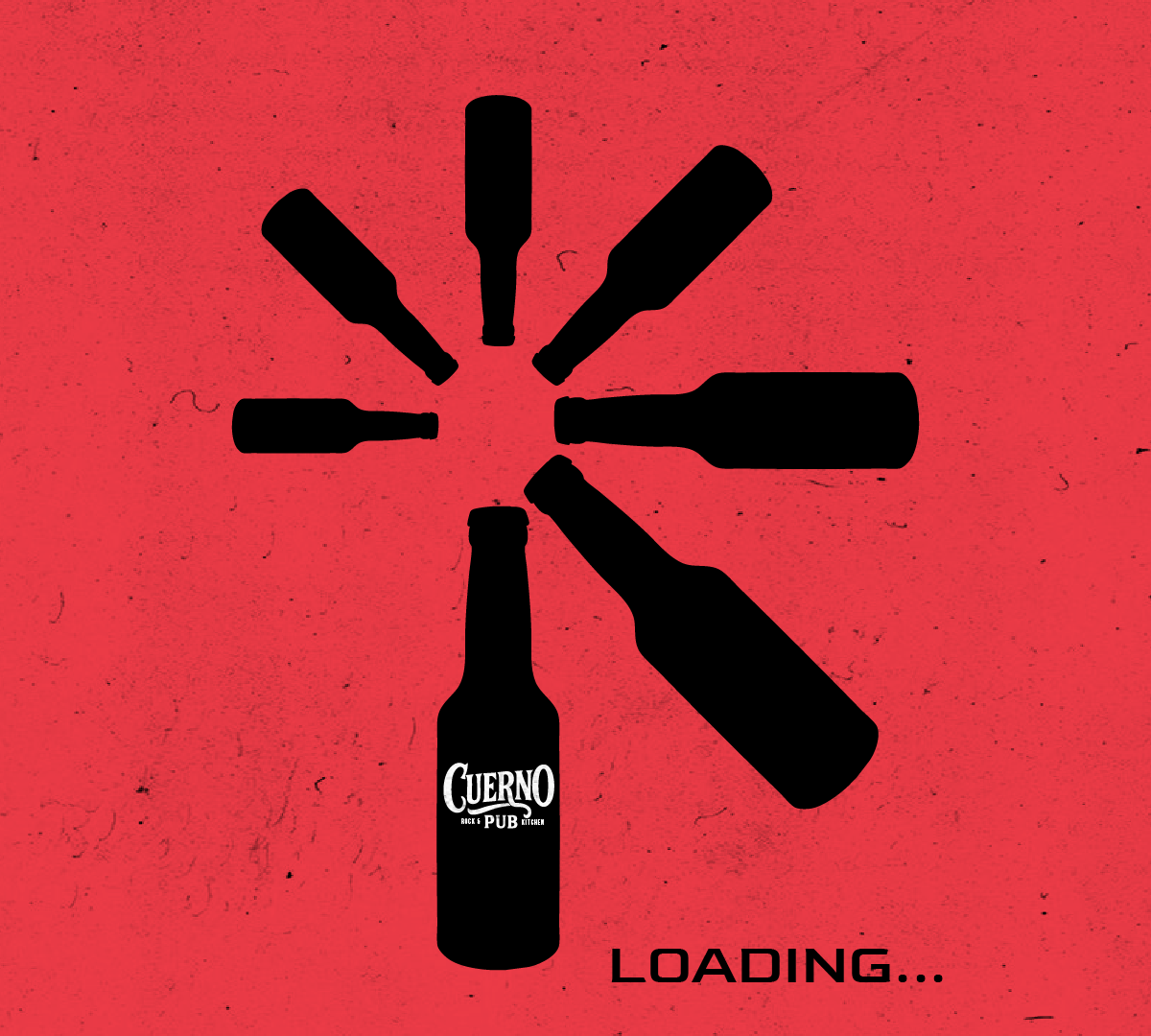
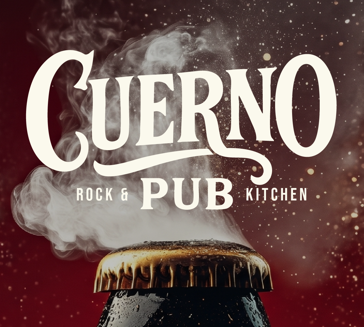
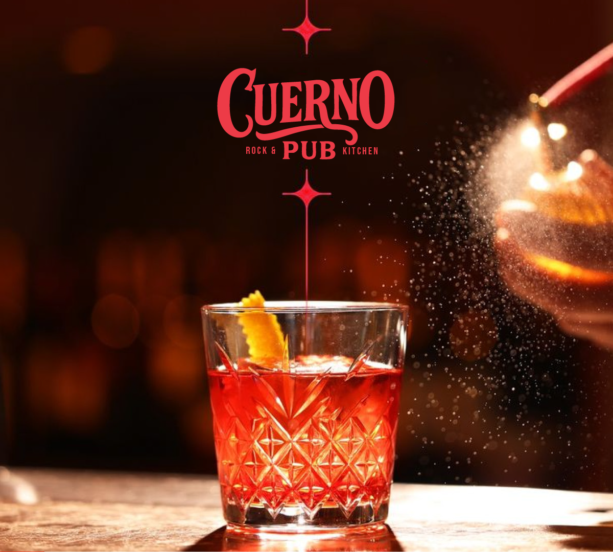
Cuerno Rock & Pub Kitchen elevates the traditional pub experience by fusing the raw, nostalgic energy of 90s rock with high-end gastronomy and mixology. Its corporate identity projects a bold, authentic character, designed to connect with an audience drawn to the vibrant, unapologetic attitude of the 1990s pub scene.

More than just a bar, Cuerno is a lifestyle brand where socializing and musical identity converge flawlessly.

Client
Our impact areas
Our work
What did we do for Cuerno?

Our work

Branding
  • Core Concept Development: Defining the fusion between 90s rock nostalgia and an elevated gastro-pub experience.
  • Brand Storytelling: Drafting the manifesto and the foundational texts of the project.
  • Main Logo Design: Creation of the emblem/isotype and the typographic logo.
  • Color Palette: Selection of brand colors (industrial, charcoal, and ember tones).
Social Media
  • Content Strategy: Communication pillars focused on culinary excellence, mixology, and the authentic nostalgia of the 90s rock pub lifestyle.
  • Brand Tone & Voice: Copywriting rules for a bold, irreverent, yet premium personality.